A Quick Overview of Goshen Arbor Day
Goshen Arbor Day
A donated web design and web development project in collaboration with Trees for Goshen. Built with love in one week using a hand-crafted theme in WordPress. Managed web hosting services provided for lightning site speed and robust security.
Project Completion Date
April 15, 2017
Client Location
Goshen, IN
Services Provided
Design
Development
Hosting
Social Media
Client Industries
Non-Profit, Environmental
Team Notes
This was one of our favorite projects of the year. Getting to work with an amazing non-profit and having design freedom as a blast.
Learn about our process on this project.
Planning and Organization
When we first heard Trees for Goshen needed a website for its upcoming event, we extended a hand to help them out. Having seen their excellent work in our community, we wanted to be able to give back to them. So, after taking on the project pro-bono, we sat down with them to do a quick planning session.
After a short discussion, it became clear this microsite could serve two purposes:
- Address the short-term need of advertising their yearly event
- Provide a design framework for moving forward with a full website for the organization
Using their advertising flyer as well as a brochure containing information about activities at the event, we mapped out a strong flow-of-content throughout the page. At the top, we started with the critical information – who, what, when, and where. The rest of the page was informational – allowing users to quickly glance through the activities at the event to determine if they would like to attend. We included contact form would be useful so users could follow up with any questions they may have had.
Design and Conceptualization
Bearing in mind this concept was going to be used on a full-fledged website down the road, we took additional steps to design and build in features which weren’t present on the microsite. We wanted to ensure the typography used on the site was flexible, and we had created a page structure which could easily be ported into more advanced subpages.
We also focused heavily on integrating more rustic concepts to build personality – from using paint strokes to separate the main messaging from the informational section, through the use of non-standard typography and fonts to quickly communicate critical points.
Take a look at how it turned out.
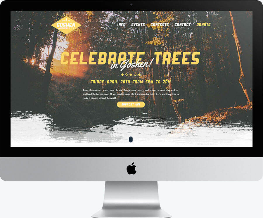
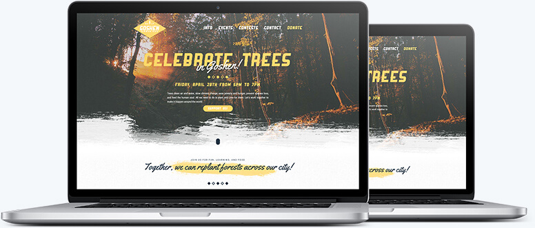
Desktop View of the Homepage
We wanted to capture the nature and excitement concept. Utilizing organic and rustic elements, we captured this nicely.
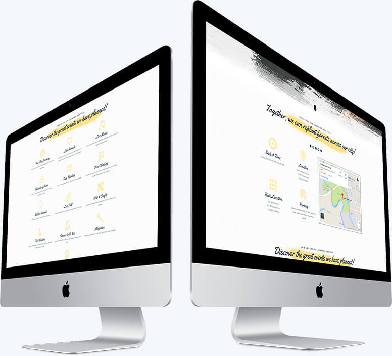
Desktop View of the Mid-Section on the Homepage
The client wanted to keep the information clean and simple. With a grid layout, we did just that.
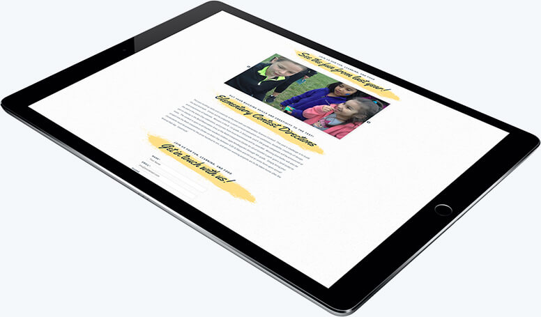
Tablet View of the Bottom on the Homepage
Using a simple slideshow, we were able to show pictures of the previous events.
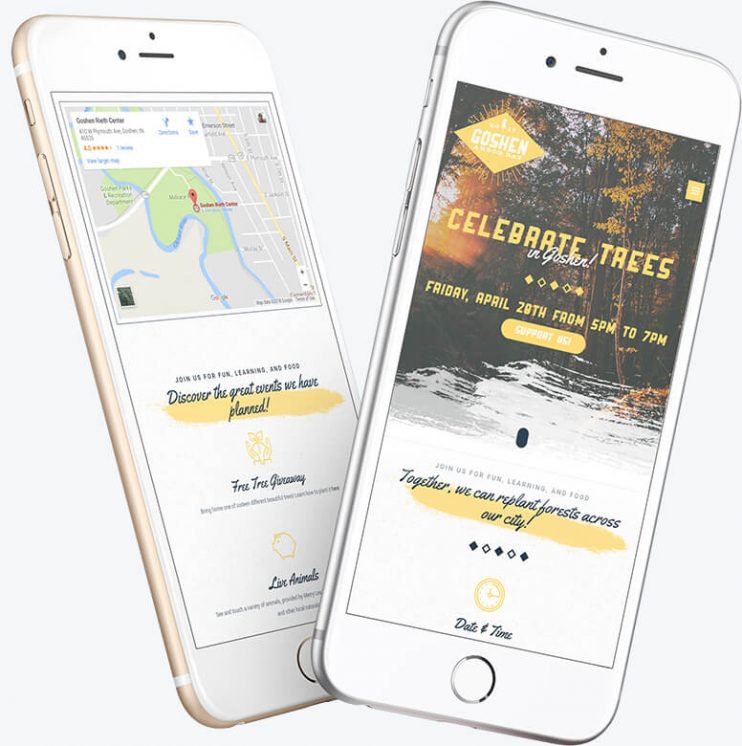
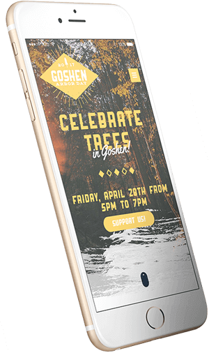
Mobile View of the Homepage
On mobile, we simplified the design while still keeping the identity rustic.