A Quick Overview of Mennonite Creation Care Network
Mennonite Creation Care Network
A web design and web development project designed to help organize a massive amount of content. We assisted in helping sort content and develop a sitemap - providing users with a smooth, usable experience.
Project Completion Date
June 15, 2018
Client Location
Goshen, Indiana
Services Provided
Web Design
Web Development
Client Industries
Sustainability
Environmental
Non-Profit
Religion
Team Notes
This project required more planning than usual upfront - the amount of content on the site needed a refined sitemap to move forward.
Learn about our process on this project.
Planning and Organization
In our initial consultations with the client, it became evident before kicking off the design phase of the project we would need to spend additional time organizing the sitemap and planning the content migration. Without doing this, we would have no idea what types of page templates would need to be built, dysfunctional navigation, and a difficult-to-use site.
Simple sites don’t often need much planning as the instructions are fairly straight-forward. We’ve templated most of our processes in this regard – cutting costs for our clients along the way.
We helped the client organize the content from their then-current website. We categorized pages and combined many of them as well, simplifying the overall structure. We then broke out the news and updates into categories within a blog section which could be pulled as excerpts into pages with relevant content.
In the final push of the planning phase, the client got to work on re-writing content based on the new plan, helping boost the search engine ranks based on keyword research.
Design Conceptualization and Execution
Starting the design phase, we put together a mood-board of heavily nature-focused websites. We realized leveraging a design with plenty of photography would convey ideas better than merely throwing “green” on everything.
We worked with the client to bring out the key goals of the visual identity they were trying to build. While they wanted the site to be clean and professional, they also wanted to convey their message. In the footer of the site, we provided a perfect space for them to do this, thus allowing their critical mission to be on every page of the website since much of their traffic came from searchers – landing users not on the homepage, but on subpages.
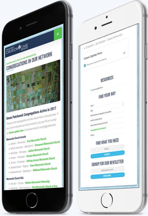
Due to the complex nature and sheer depth of content on the site, we focused heavily on building clear navigational controls for both desktop and mobile. Through research, we discovered users found information more quickly when subpages had a simple, collapsible, in-page navigation which highlighted their location on the site.
Content Entry and Launch
The final piece of the puzzle on this project was to migrate their content – which had been partially re-written – into the new site. Unfortunately, due to the nature of the previous website, we had to input each page manually. However, we had built a robust content management system for the client. So, we trained the client before launch and provided in-depth documentation. The client was then able to import much of the content and copy themselves – resulting in a significant cost reduction.
People often skip redirecting their old pages to the new URLs when they redesign a site. This is a huge mistake that loses time and money in search engine ranking work.
After migrating, we set up redirects for the pages on the previous site to map them to the proper locations on the new website. This is mission-critical in all redesigns. Skipping this step loses all of the SEO value your previous pages garnered and throws away years of work. As a failsafe in case we had missed a redirect, we also installed and 404 tracking plugin which allowed us to analyze and find any broken links on the site – as well as assisting the client in setting up any redirects in the future.
After a final quality insurance check and implementing social media tools, we took the site live without a hiccup.
Take a look at how it turned out.
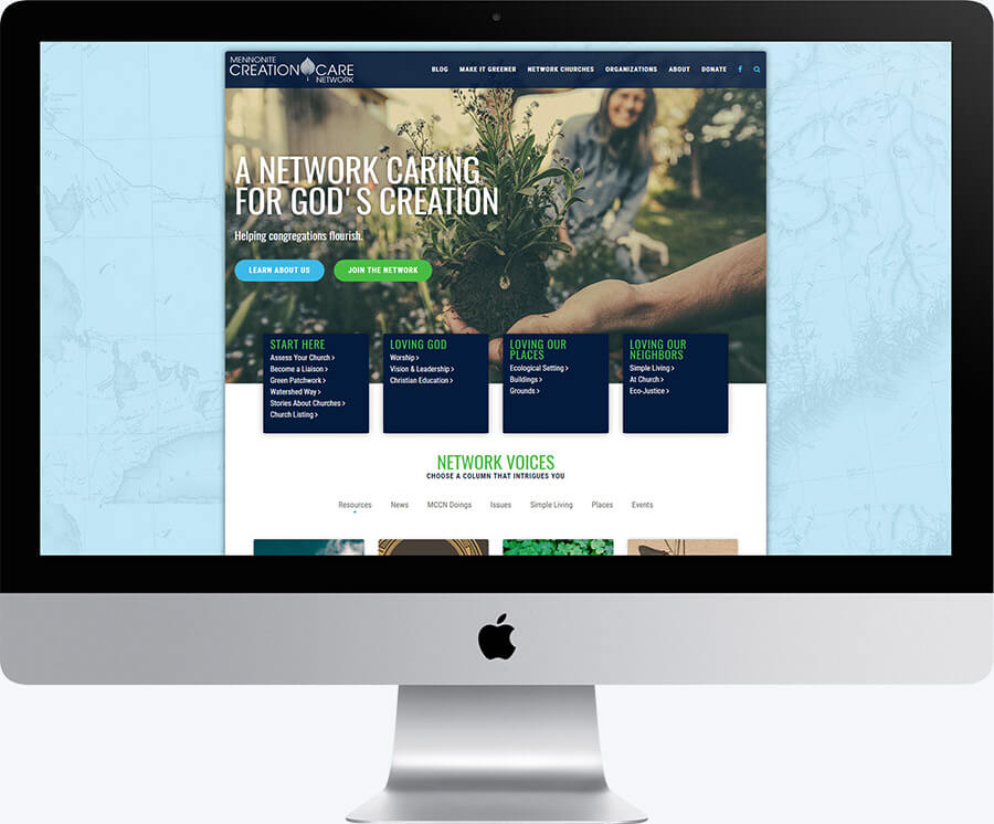
Desktop View of the Homepage
We used in-page navigation to assist the users in finding their content in addition to the navigation in the header and footer.
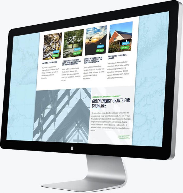
Desktop View of the Mid-Section on the Homepage
Blog posts and news updates were frequent on the site. We also gave them a section to feature their green energy program.
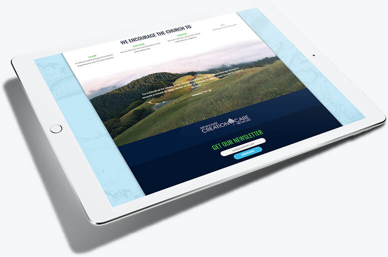
Tablet View of the Footer
The footer was designed to lay out the organization's mission and features a quote from The Bible that's critical to their ideas.
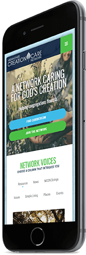
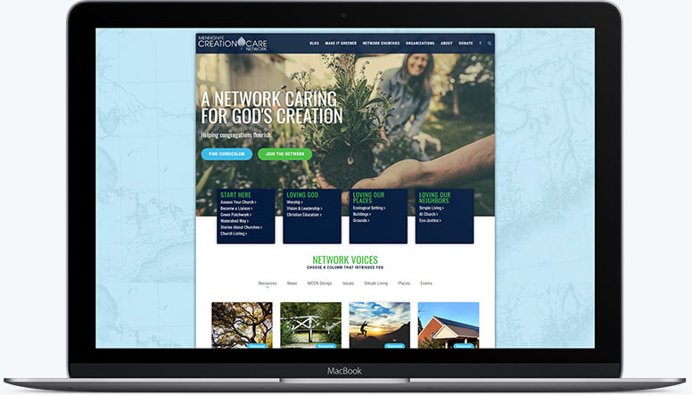
Mobile View of the Homepage
We kept the site clean and navigable without losing any functionality.
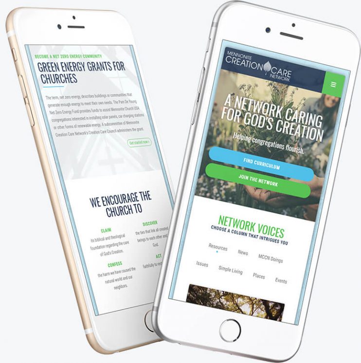
Mobile View of a Subpage
We emphasized typography and navigation for subpages as the site had an impressive amount of content.